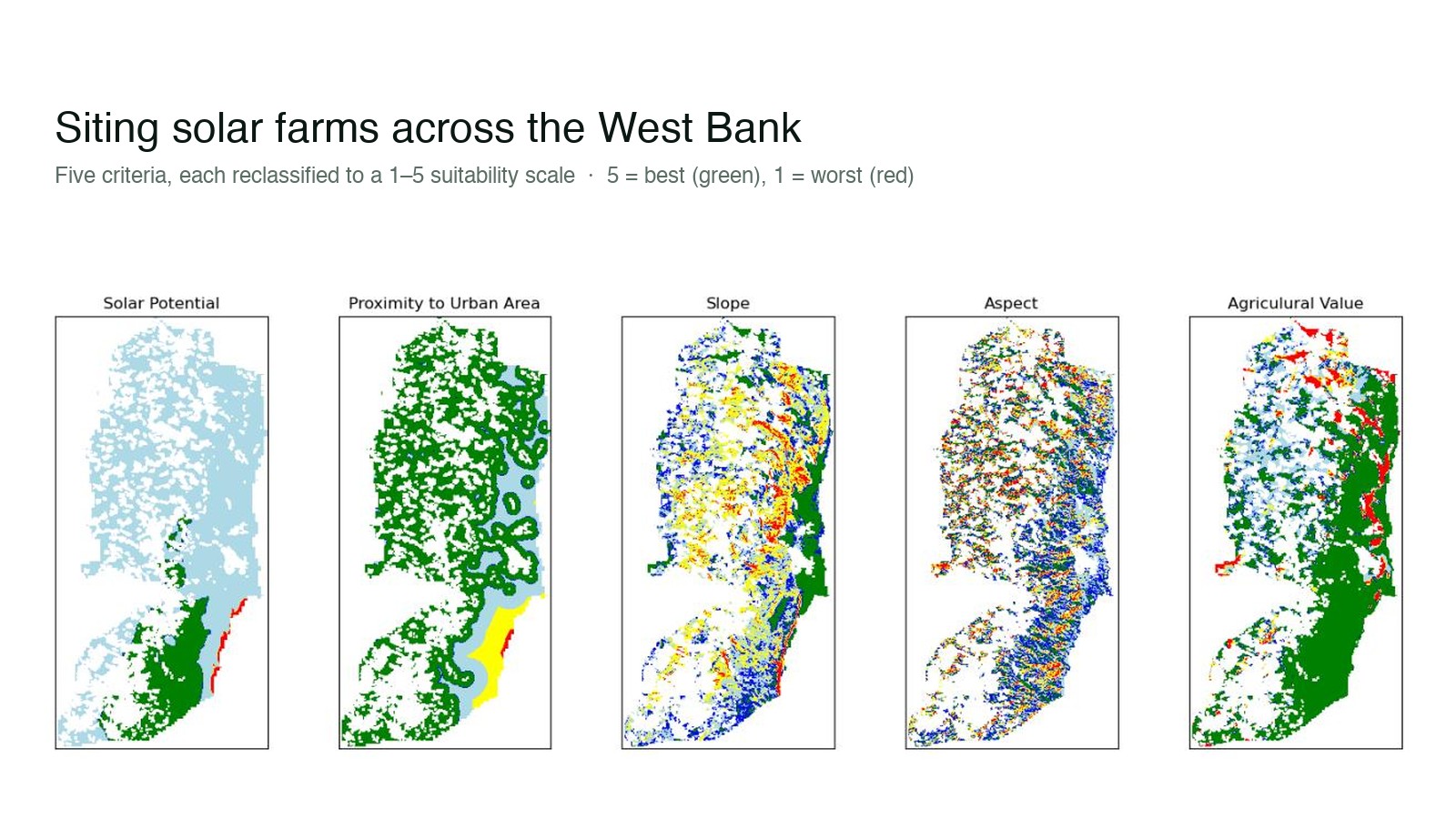
The five criteria behind the model: solar potential, distance to towns, slope, aspect, and agricultural value, each reclassified to a common 1–5 suitability scale across the West Bank.
A transparent weighted-overlay model that scores every cell of the West Bank for how well it suits a solar farm, balancing terrain, sunlight, farmland value, and distance to towns, then distilling a noisy surface into a handful of clean candidate zones.
The five criteria behind the model: solar potential, distance to towns, slope, aspect, and agricultural value, each reclassified to a common 1–5 suitability scale across the West Bank.
Siting a solar farm is a negotiation between physical factors that rarely agree. You want gentle, south-facing slopes with strong sunlight, on land that isn't prime farmland and isn't stranded far from where the power is used. No single layer answers where should this go?. The answer lives in how you weigh them against one another.
So I built a small, transparent multi-criteria model to do exactly that, with the West Bank as the worked example. The point wasn't a one-off map; it was a method a planner could re-run, re-weight, and defend.
The model runs as a short, deliberately legible pipeline:
The five inputs, each reclassified to the 1–5 scale (5 = green, 1 = red). Slope and aspect come from terrain; agricultural value protects productive land; proximity keeps sites near demand.
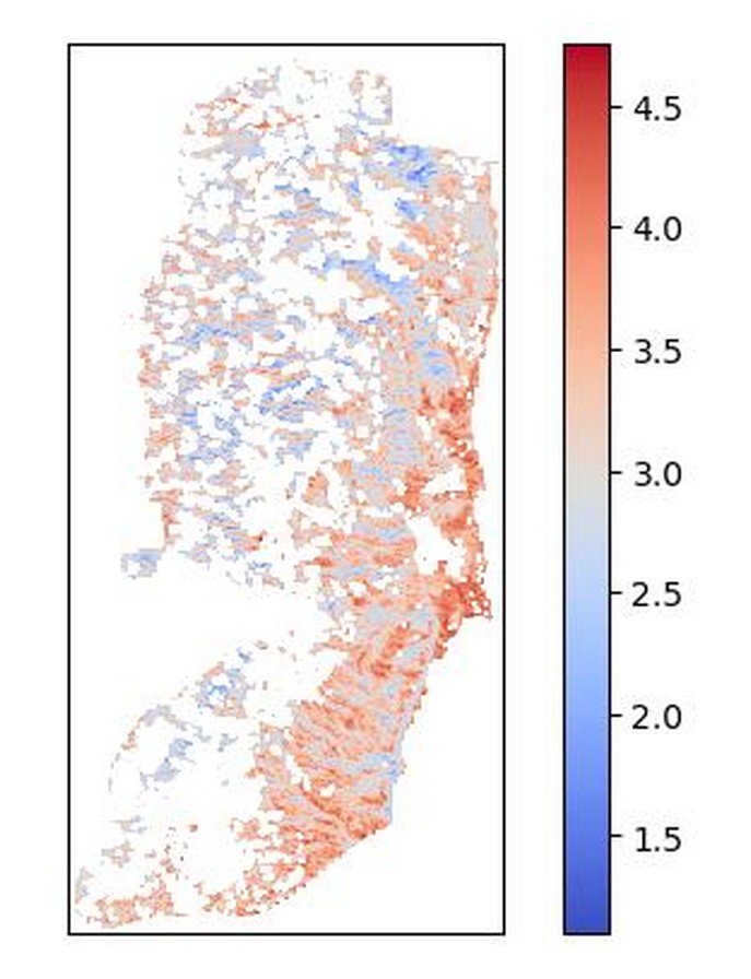
The weighted suitability surface: every cell scored from low (blue) to high (red) by combining the five layers.
The filtering is what makes the output usable. A raw suitability surface is too speckled to act on; grouped and denoised, it resolves into coherent candidate zones ranked by quality.
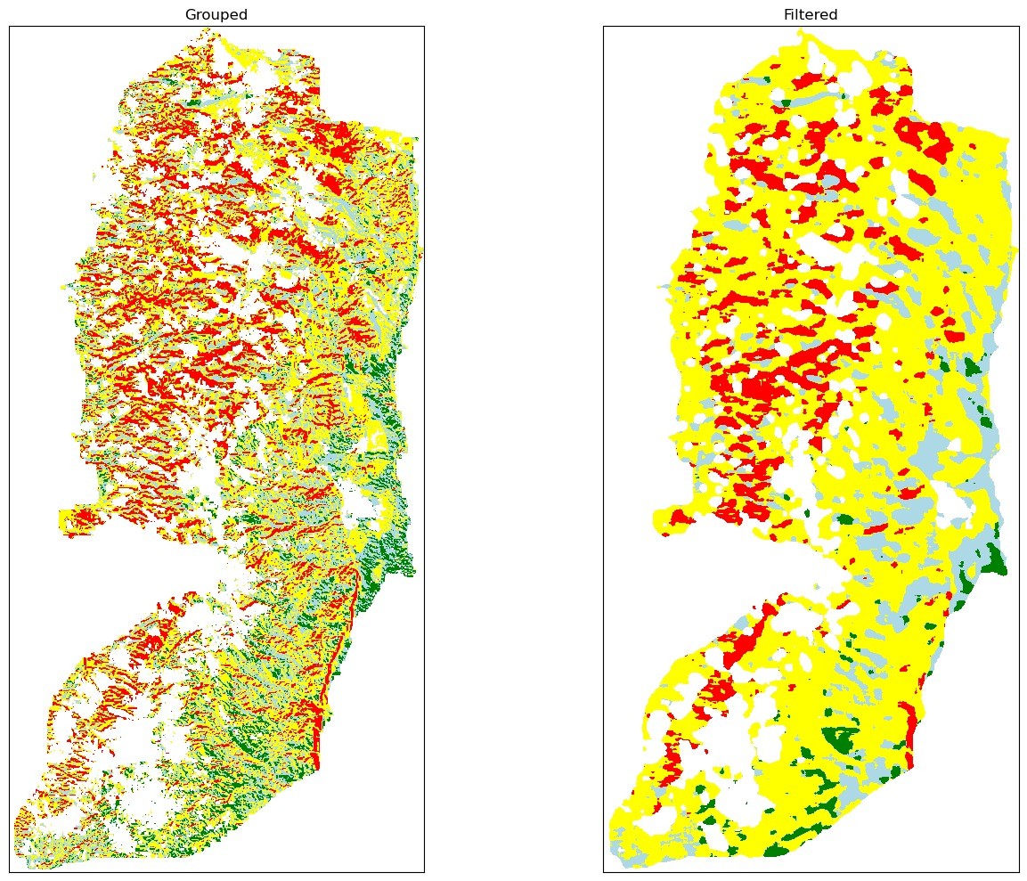
From grouped classes (left) to the filtered, clustered result (right). Very good = green, good = blue, ok = yellow, avoid = red. The cleanest ground pulls away from the steep central highlands.
And because the weighting is explicit, it's adjustable. Favour flat ground over orientation, or protect more farmland, and the zones redraw. That makes it less a single verdict than an instrument for arguing about the trade-offs with the map in front of you.