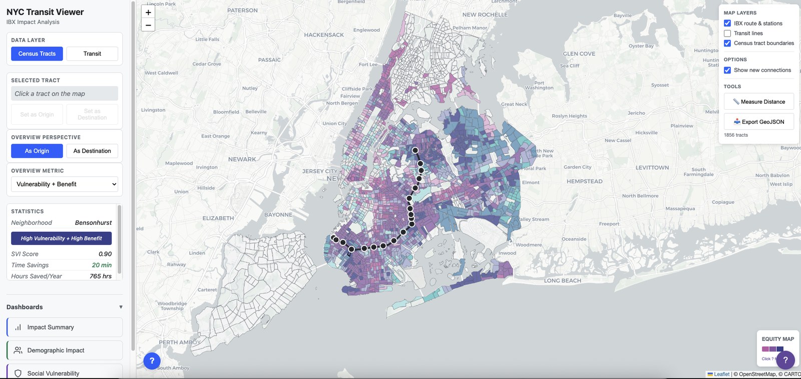
The equity map: each tract shaded by social vulnerability against the travel-time it gains from IBX, the test being whether benefit reaches the communities that need it most.
An interactive map that lets you explore what the proposed **Interborough Express** would do to travel across New York, and, crucially, how it impacts the communities around the boroughs. Built to let a graduate planning course explore that question directly.
The equity map: each tract shaded by social vulnerability against the travel-time it gains from IBX, the test being whether benefit reaches the communities that need it most.
The Interborough Express (IBX) is a proposed light-rail line linking Brooklyn and Queens along an existing freight corridor. It's a rare direct connection between two boroughs in a network that funnels almost everything through Manhattan. It's still just a proposal and in the early phases, which allows for a plethora of topics to explore.
This tool was built for ARCH 7132, a Spring 2026 graduate urban design studio at Cornell University's College of Architecture, Art, and Planning, co-taught by Garine Boghossian and Kobi Ruthenberg. It investigated the potential of new transit infrastructure to catalyze strategic densification and integrated urban transformation along the corridor, addressing the interrelationships among mobility, housing, public space, economic development, and the existing urban fabric.
Garine and Kobi were both colleagues of mine at ORG, so we decided to build this tool to help students explore the IBX while developing a useful piece of IP for ORG. It was built on the base of the transit-modelling work we had already done for MOSH in Antwerp, answering the same core question of "if we change the network here, who is actually better off?", but now pointed at New York.
The result is a single interactive map with two ways in:
Underneath sit four main dashboards. City-wide impact, transit-network effects, demographic breakdown, and a social-vulnerability analysis.
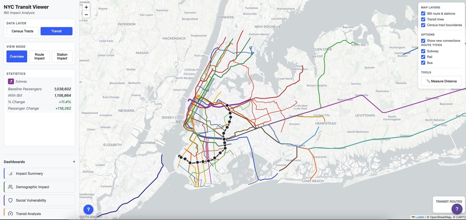
The network view: as trips shift onto IBX (dotted), the model redistributes ridership across the existing subway and bus routes: feeders gaining, parallel service shedding load.
Three things came through clearly:
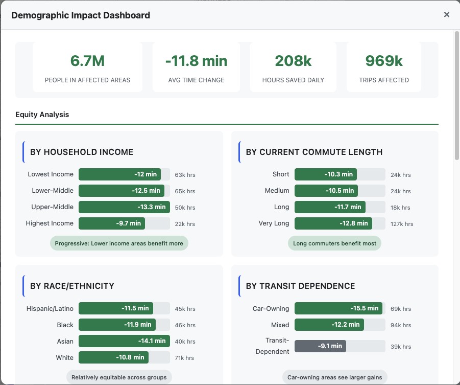
The demographic dashboard breaks the time savings down by income, commute length, race/ethnicity and transit dependence: the equity question answered from four angles at once.
The model combines two pieces. First, an origin–destination trip matrix built by David Birge estimates how many trips flow between every pair of census tracts: the actual demand the network carries. Second, a RAPTOR routing model (Round-Based Public Transit Routing) computes the travel time for each of those tract-to-tract journeys across the entire MTA network, run twice, once as the network stands today, once with IBX added.
Weighting each journey's time change by the number of trips that actually make it is what turns abstract minutes into real figures: the person-hours saved, the trips affected, the neighbourhoods that gain. Python scripts aggregate that output into the dashboards; the front end is a single self-contained page (Leaflet for the map, Chart.js and d3 for the charts) served from pre-computed data, so it stays fast with no backend. The remaining inputs are all public: MTA network and ridership, US Census ACS 5-year estimates, the CDC/ATSDR SVI 2022, and NYC Open Data boundaries.
Everything here is a model of a proposal: projected demand and modelled travel times, not observed data. The point was never a precise forecast; it was to give a room full of planners a defensible, explorable picture of the trade-offs. The model is still there to build on, and it's something ORG may pick up again.